")
Using the new Themes, (White Lilly pictured here), when the browser is resized, the MainPain section does not scale correctly with the header and footer. See picture below:
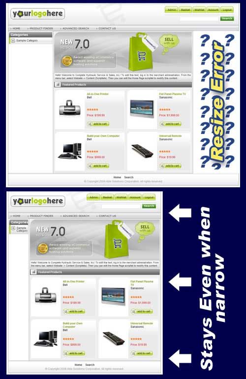
What do you think? Is there a way to make the right border on these sections stay consistently matched up insead of having that wierd wihite space? Is this intentional as a 3rd / right column for content that just needs to be activated / declared?
Help is appreciated! I will also report this on the possible bugs post...